GoGo
A Social Event App

Overview
The Go Go App is a social networking platform specifically designed for older adults, within retirement age, seeking to stay active, forge meaningful connection and embark on unforgettable journeys. From arranging local meetups and attending events to planning group trips and adventures, the platform offers a diverse range of opportunities for like-minded individuals to come together, explore new interests, and create lasting friendships.
Solo UI/UX Designer
-
User Research
-
Prototyping
-
Usability Test
-
Visual Design
Tools: Figma
Timeline: Feb 2024 - March 2024
Roles & Responsibilities
Context
As part of an intensive UI/UX course through Google, I was tasked with designing a user experience for social good as my last portfolio project. I chose to create The Go Go App, a social networking platform designed for older adults to meet new people and stay active.
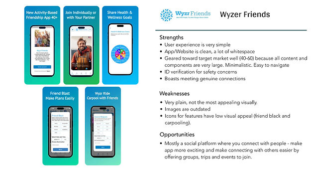
Competitive Analysis
I started my process by conducting market research and a competitor analysis to better understand who my competitors were and what they did well or poorly. I analyzed key objectives, marketing profile, and overall strategy. This allowed me to identify their strengths and opportunities for my app.

Problem Statement
Best Solution
Life can slow down as you get older, making it hard to meet people and even harder to maintain an active lifestyle.
The Go Go app user needs a way to avoid being stagnant and lonely.
Create a social platform for users to build genuine connections with like minded people, and maintain an active lifestye by attending events and trips.
User Interviews
I conducted three remote user interviews to gain a well-rounded understanding of my users' needs, goals and points of friction.
Target Market: Ages 55-70, within retirement age, that have some understanding of social media, and have historically lead active lives.
The interviews helped me identify the following pain points and gains: Difficulty finding social events tailored to their interests and preferences. Frustration with outdated or inefficient methods for discovering activities. Concerns about the learning curve and usability of new technologies for socializing. Gains: Increased opportunities for social interaction and engagement. Enhanced sense of belonging and community. Empowerment through accessible, user-friendly technology solutions.

 |  |
|---|


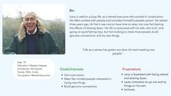
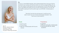
User Personas
Using my findings from the ideation phase, I created two user personas to represent users with different backgrounds and needs.
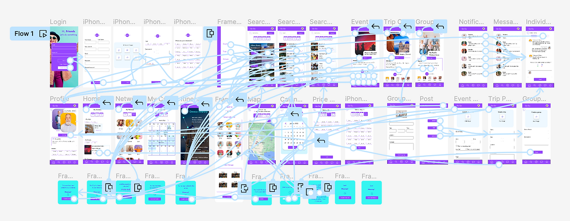
User Flow
In addition, I created user journeys and user flows for the app's main functions. I wanted to understand how my users would complete a function and what they would need to accomplish it.
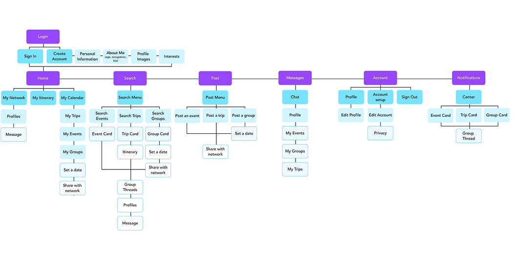
Site Map
The Go Go App site maps begins as a sequential site structure, guiding the user through creating an account. After completing this process, the site is more geared toward a data base structure, allowing users to personalize their experience depending on what they would like to search for and offering varied navigation paths. I chose to structure the site this way because it offers flexibility and high interconnectedness between various pages.
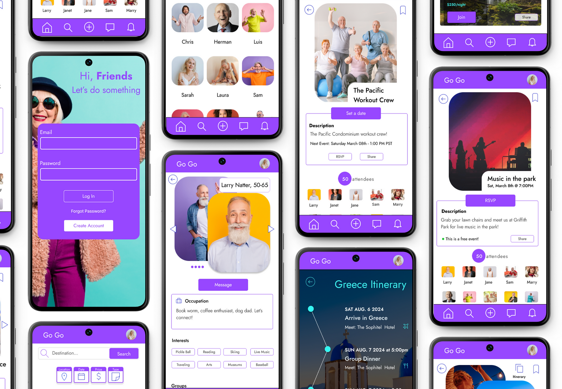
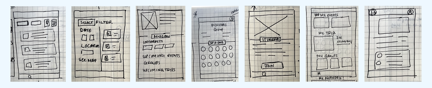
Wireframes
I completed seven paper wireframes and transferred them to Figma incorporating these main functions:
01.
Navigation
Clear and intuitive navigation.
02.
Calendar
Keep track of RSVPs with a personalized calendar.
03.
Events
Search events, trips and groups to attend.
04.
Network
Build a network of genuine connections.
05.
Itinerary
Access to personalized itineraries.
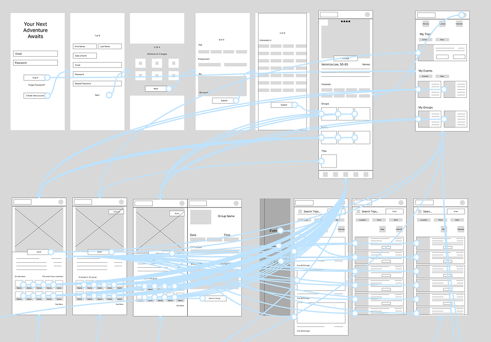
Next, I connected each screen. The main user flow is meant to guide the user through the process of creating an account/profile and searching for events, trips or groups to join.
Usability Testing
I asked participants to complete a series of tasks that helped me understand their thought processes. I also asked about their likes and dislikes of the prototype.
After the interviews, I ranked my observations into concrete issues in order to help me prioritize the most important pain points and propose new solutions for my next iteration.
Task 01.
Create an account.
Task 02.
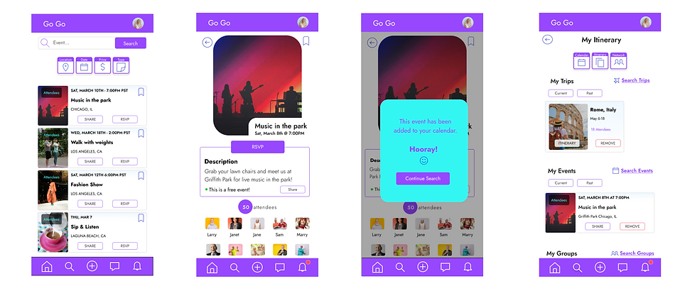
Add an event to your calendar.
Task 03.
View a trip itinerary and add the trip to your itinerary.
Task 04.
Create a group and set an event date.
Task 05.
Send a message to someone in your network.
Mockups
I used these actionable insights and implemented them into my designs to create mockups, adding images, color and typography.
Preference Test

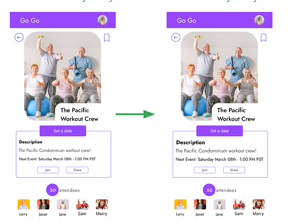
80% of participants opted for filters to be uniform and easily accessible. Keeping them in a common region, grouping them together and making them similar to one another as opposed to the initial increased size, improved user understanding of functionality.
80% of participants opted to increase the font size of most sections by at least two points. Some sections were also bolded for clarity.
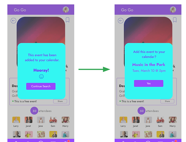
60% of participants opted to add a confirmation screen in order to avoid accidental selections, along with the confirmation screen leading to the next action.
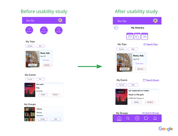
80% of participants needed a more intuitive experience when arriving at each page. Animated buttons were added to each section. When arriving on a page the next action will blink.
I used Figma to create a clickable prototype as the first step in the iteration to refine my design.

1. The design uses high contrast colors with a ratio of 6.06:1 and is AAA compliant.
2. The app is designed with clear affordances in mind, with buttons and icons that look interactive and clickable. The buttons are also large and centered for varying hand sizes.

Final Thoughts
“I would absolutely use this app! I wouldnt descibe myself as a very technologically advanced person. I usually need to ask my kids for help. But this app was pretty easy for me to figure out and that's saying something!".
-Troy Walton, Los Angeles
Impact:
Regardless of social media skill level, GoGo guide users through the process of creating an account, navigating events and trips to add to their calendars and connecting with others.
The Go Go app was designed to connect older adults looking to stay active and meet new people by attending events and trips. The navigation is clear, simple and intuitive.
For a life filled with adventure and genuine friendships.
What I learned:
This project taught me how important it is to truly understand your user. Things that I would assume are known or come as second nature are personal biases and can be detrimental. For instance, some study participants did not recognize the hamburger menu. This resulted in me intentionally avoiding using common symbols/icons and using large alt text.
Next Steps:
Though I made a considerable effort to make the navigation as simple as possible, there are ways to make the process even more intuitive. I would do another usability test study to test making the process easier and more efficient.
In addition, I would explore another community feature that encourages user engagement, such as a point system for attending events or trips. I would also want to explore incorporating volunteer and social causes to the platform to help users get involved in their communities.