
Fluer
A Flower Catalogue App
Overview
Life gets busy. Remembering special occasions is only half the battle.
Fluer simplifies flower shopping for thoughtful gift givers and flower connoisseurs alike. Find the perfect arrangement for any occasion by using a filtered search, personalize the experience by using the build your own bouquet feature and make edits to orders up to 12 hours before delivery.
A traditional gesture with flexibility.
Role and Responsibilities
Solo UI/UX Designer
-
User Research
-
Prototyping
-
Usability Test
-
Visual Design
Timeline: 2 months (08/23 - 10/23)
Tools: Figma
Context
As part of an intensive UI/UX course through Google, I was tasked with completing a project. I chose to create Fluer, a flower catalogue app that guides users through the shopping process.
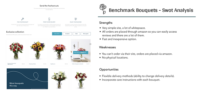
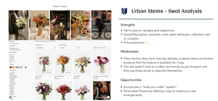
Competitive Analysis
I started my process by conducting market research and a competitor analysis to better understand who my competitors were and what they did well or poorly. I analyzed key objectives, marketing profile, and overall strategy. This allowed me to identify their strengths and opportunities for my app.

Problem Statement
Best Solution
The Fluer user needs an a way to pre-order bouquets, so that whomever the user purchased said flowers for can recieve them. This will make both people happy :)
We will measure effectiveness by tracking successful orders placed and delivered.
Create a platform for users to find the perfect arrangement, based on specified preferences. Making the process of flower shopping and delivery personal, and more efficient.
User Interviews
I conducted three remote user interviews to gain a well-rounded understanding of my users' needs, goals and points of friction. The research helped me confirm or revise my possible solutions and user stories. From there, I decided to create the app with the following main functions:
01.
Filters
Select your preferences and search flowers by price, occasion, flower type and delivery. Set up recurring orders or pre order flowers up to years in advance.
02.
Flexible Delivery
Change/edit delivery time/date up to 12 hours before delivery.
03.
Design your own bouquet
Personalize the experience selecting from a variety of stems and petals to design your own bouquet.
04.
Care instructions
Proper care instructions for each bouquet, to keep your flowers fresher, longer.
05.
Suggestions
Access bouquets suggested for you based on your preferences. Search most popular and trending bouquets.

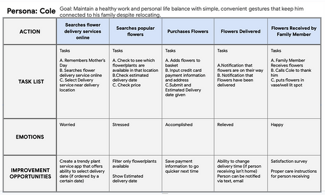
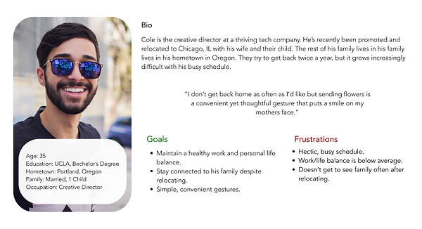
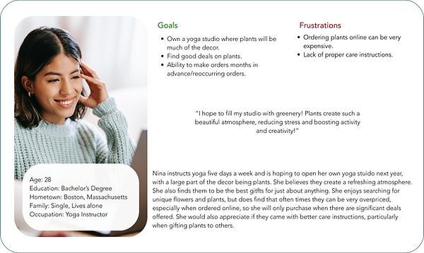
User Personas
Using my findings from the ideation phase, I created two user personas to represent users with different backgrounds and needs.
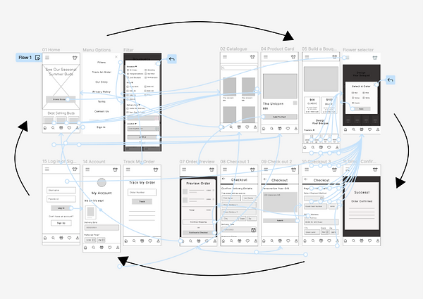
User Flow
In addition, I created user journeys and user flows for the app's main functions. I wanted to understand how my users would complete a function and what they would need to accomplish it.

Site Map
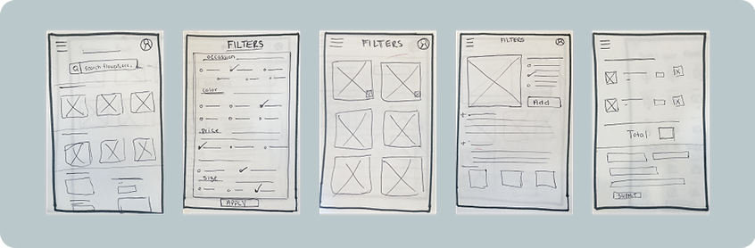
Next, I started sketching low-fidelity wireframes with a pen and paper. I moved on to Figma for my id and high-fidelity wireframes. Throughout the different fidelity stages, continuous iterations were made to improve the app's overall functionality and UX.

Wireframes
Next, I started sketching low-fidelity wireframes with a pen and paper. I moved on to Figma for my id and high-fidelity wireframes. Throughout the different fidelity stages, continuous iterations were made to improve the app's overall functionality and UX.
I used Figma to create a clickable prototype as the first step in the iteration to refine my design.

Task 01.
Find the filter icon and create a filtered search.
Task 02.
Select a product and add it to your basket.
Task 03.
Find your way back to the home page. Once there, select the button to begin building your own bouquet.
Task 04.
Go through the process of building a bouquet. Once complete, add it to your court and check out.
Task 05.
Finally, from the home page, figure out where you can track your order and make edits to delivery date and time.
Usability Testing
Using my prototypes, I conducted six moderated remote usability tests. During the test, I asked them to complete a series of tasks that helped me understand their thought processes. This was also the perfect time to ask about their likes and dislikes of the prototype.
After the interviews, I ranked my observations into concrete issues in order to help me prioritize the most important pain points and propose new solutions for my next iteration.
Preference Test
75% of participants opted for a filter feature with less clutter, allowing the user to switch between categories easily.
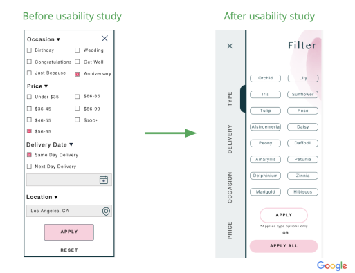
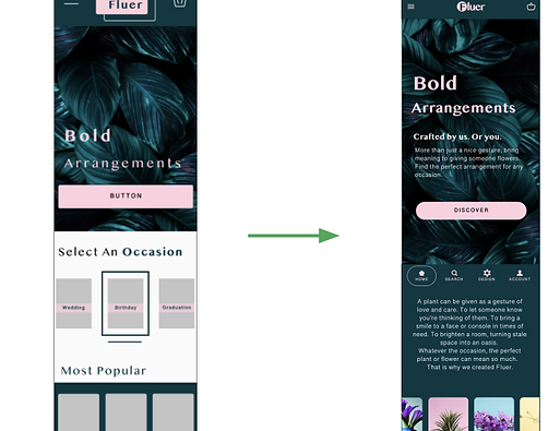
80% of participants needed clearer navigation, opting for the main navigation bar to be sticky.
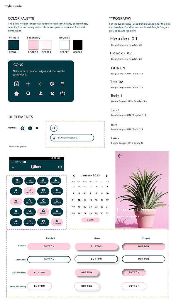
1. The design uses high contrast colors with a ratio of 9.25:1 and is AAA compliant.
2. The app is designed with clear affordances in mind, with buttons and icons that look interactive and clickable. The buttons are also large and centered for varying hand sizes.
3. App and images have alternate text that can be read by a screen reader as well as larger font for reader-friendly design.
