

Thriftly App
Roles/Responsibilites
Solo UI/UX Designer
-
User Research
-
Prototyping
-
Usability Test
-
Visual Design
Overview
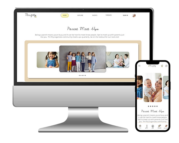
As part of an intensive UI/UX course through Google, I was tasked with completing a project. I chose to create Thriftly, an online marketplace and community for baby, kids and maternity clothes.
Context
Thriftly is an online national resale store that offers clothing for resale or trade. It aims to connect buyers and sellers to provide quality, vetted clothing for purchase or trade. The site offer’s online closets where users can list their items to make available to the public. Buyers and Sellers communicate via chats and organize to ship or meet locally to exchange. The site organizes frequent events where expecting mothers and mothers can meet to barter clothing.
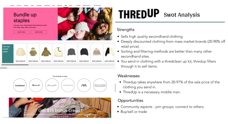
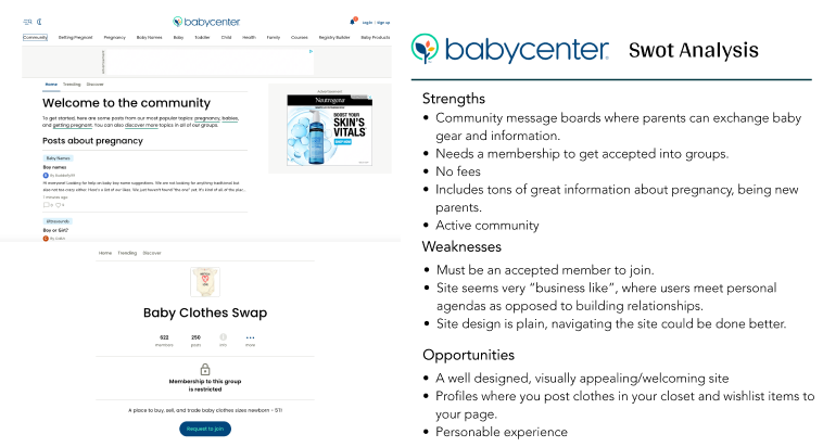
Competitive Analysis
I started my process by conducting market research, and a competitor analysis to better understand who my competitors were and what they did well or poorly. I analyzed key objectives, marketing profile, and overall strategy. This allowed me to identify their strengths and opportunities for my app.

Problem Statement
The Thriftly user needs a way to connect with other users in order to buy, sell, or trade goods and share information, which will affect parents by offering an inexpensive way to replace clothing and a solution to get rid of clothing their children have outgrown.
We will know this to be true when we see users making successful trades or purchases.
Best Solution
Create a platform for users to access a community, to connect with one another through messages, providing a marketplace to trade, buy or sell baby, kid and maternity goods.
User Interviews
I conducted three remote user interviews to gain a well-rounded understanding of my users' needs, goals and pain points. The researched helped me confirm or reivse my possible solutions and user stories. From there, I decided to create the app with the following main function:
1
Online Marketplace
A place for parents to buy, sell or trade baby, kid, and maternity gear.
2
Community
Join live threads and connect with other parents in your area. Organize parent meet ups for clothing swaps, kid play dates, or adult hang outs.
3
Profiles
Create a profile to build your online closet with items you're looking to part ways with, make a wishlist of items you are on the hunt for, and join local swap events, parent meet ups, and community groups.
User Personas
Using my finding from the ideation phase, I created two user personas to represent users with different backgrounds and different needs


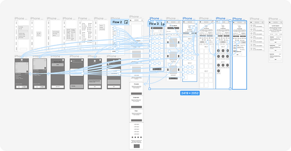
User Flow
In addition, I created user journeys and user flows for the app's main functions. I wanted to understand how my user's would complete a function and what they would need to accomplish it.

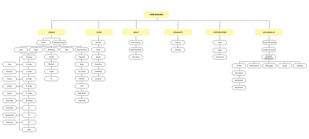
Site Map
Wireframes
Next I sketched out paper wireframes for each screen in my app. I created a small, medium and large version to make sure the site would be fully responsive.


Usability Test Findings
Next I conducted another unmoderated usability with five participants and these were the main findings I uncovered:
1
2
3
Search
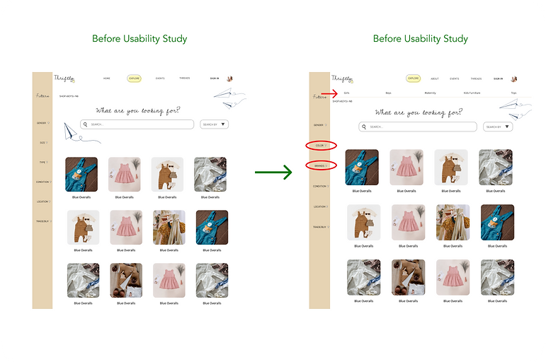
Once on the explore (search) page, user’s had trouble finding how to search for specific categories.
Filters
User’s found the organization of the filters/search options confusing and that some of the filter options should instead be accessible search options on a menu.
Home
After completing all tasks, user’s were most confused by the home page due to it not being necessary for most functions.
Preference Test
Next I sketched out paper wireframes for each screen in my app. I created a small, medium and large version to make sure the site would be fully responsive.


Accessibility Considerations
Final Thoughts
Next I conducted another unmoderated usability with five participants and these were the main findings I uncovered:
Impact
Our target users expressed how they were happy that the site gave them a sense of “do good” and community connection.
"The navigation of the site and simplified search is something I can see myself using in the future, this will definitely help me save money!”.
-Leah McKlean
What I learned
I learned that how important identifying personal biases are. My users consistently pointed out design flaws that weren’t initially on my radar and making a few subtle navigation changes really helped my users flow more efficiently.
Next Steps
My next steps would be to identify any additional areas of need and ideate on new features, particularly regarding the community features/groups. Next I would retest my design and conduct follow up usability test.